The flexbox or flexible box model in CSS is a one-dimensional layout model that has flexible and efficient layouts with distributed spaces among items to control their alignment structure ie., it is a layout model that provides an easy and clean way to arrange items within a container.
The Flexible Box Module, usually referred to as flexbox, was designed as a one-dimensional layout model, and as a method that could offer space distribution between items in an interface and powerful alignment capabilities. This article gives an outline of the main features of flexbox, which we will be exploring in more detail in the rest of these guides.
The main idea behind the flex layout is to give the container the ability to alter its items’ width/height (and order) to best fill the available space (mostly to accommodate to all kind of display devices and screen sizes). A flex container expands items to fill available free space or shrinks them to prevent overflow.
Most importantly, the flexbox layout is direction-agnostic as opposed to the regular layouts (block which is vertically-based and inline which is horizontally-based). While those work well for pages, they lack flexibility (no pun intended) to support large or complex applications (especially when it comes to orientation changing, resizing, stretching, shrinking, etc.).
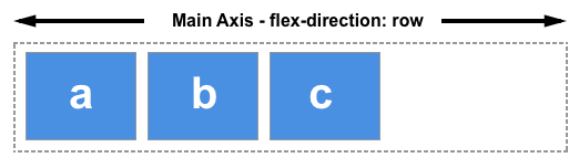
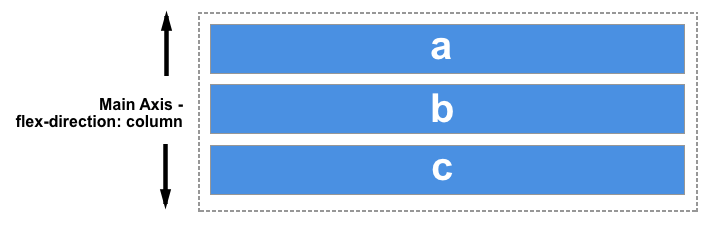
The main axis
The main axis is defined by flex-direction, which has four possible values:
rowrow-reversecolumncolumn-reverse
Should you choose row or row-reverse, your main axis will run along the row in the inline direction.
Choose column or column-reverse and your main axis will run from the top of the page to the bottom — in the block direction.
The cross axis
The cross axis runs perpendicular to the main axis, therefore if your flex-direction (main axis) is set to row or row-reverse the cross axis runs down the columns.

If your main axis is column or column-reverse then the cross axis runs along the rows.

Features of flexbox:
- A lot of flexibility is given.
- Arrangement & alignment of items.
- Proper spacing
- Order & Sequencing of items.
- Bootstrap 4 is built on top of the flex layout.
Before the flexbox model, we had 4 layout modes:
- Block: It is used to make sections in web pages.
- Inline: It is used for text.
- Table: It is used for two-dimensional table data.
- Positioned: It is used for the explicit position of an element.
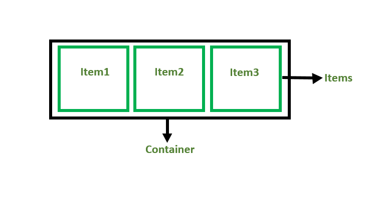
Flex Container
The parent “div” which contains various divisions is called a flex container.
Flex Items
Browser support
This browser support data is from Caniuse, which has more detail. A number indicates that browser supports the feature at that version and up.
- Google Chrome 29.0
- Firefox 22.0
- Microsoft Edge 11.0
- Opera 48.0
- Safari 10.0
Examples
<!DOCTYPE html>
<html>

<head>
    <title>Flexbox Tutorial</title>
    <style>
    .flex-container {
        display: flex;
        background-color: #32a852;
    }

    .flex-container div {
        background-color: #c9d1cb;
        margin: 10px;
        padding: 10px;
    }
    </style>
</head>

<body>
    <h2>GeeksforGeeks</h2>
    <h4> Flexbox</h4>
    <div class="flex-container">
        <div>Item1</div>
        <div>Item2</div>
        <div>Item3</div>
    </div>
</body>

</html>